Pantone trend colour 2026
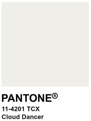
With Pantone 11-4201 Cloud Dancer, the Pantone Color Institute has, for the first time, designated an off-white as its Colour of the Year for 2026. This decision is less an aesthetic statement than a strategic signal: minimalism is the answer to visual overload, hybrid complexity and growing demands for orientation and identity within a space.
For businesses, the question is therefore not whether to use a trend colour – but how to make it strategically effective.
Modern working environments today fulfil several functions simultaneously: enabling concentration, promoting collaboration, strengthening identification and supporting flexibility. Colour schemes play a structural role in this:
they zone spaces, create visual hierarchies, influence perception and behaviour, and stabilise brand identity within a space.
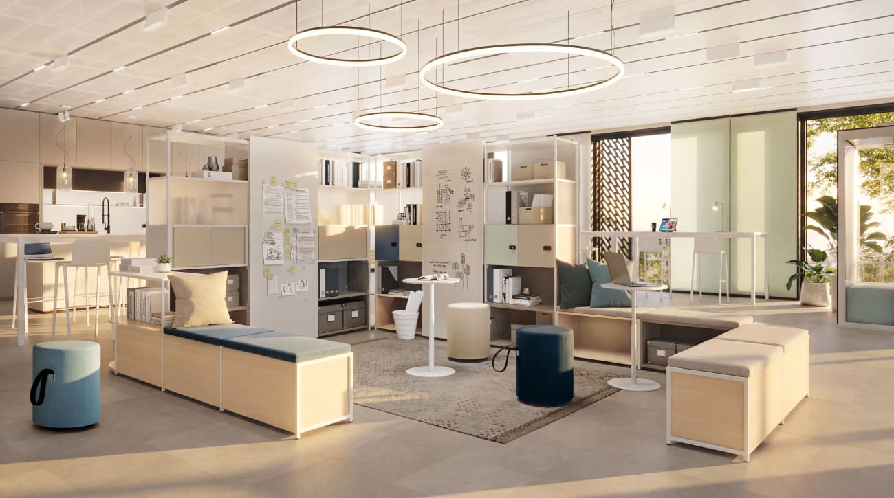
A calm off-white shade such as Cloud Dancer is particularly suitable as a supporting base colour, as it does not dominate but rather organises. In strategic colour schemes, Cloud Dancer can cover around 60–70% of the visible base surfaces – walls, larger furniture surfaces, acoustic elements or room-in-room systems. The remaining 30–40% is used to create differentiation through accent colours, materials or brand-specific elements.
This ratio creates:
Cloud Dancer is not a decorative stylistic device, but a structural tool.
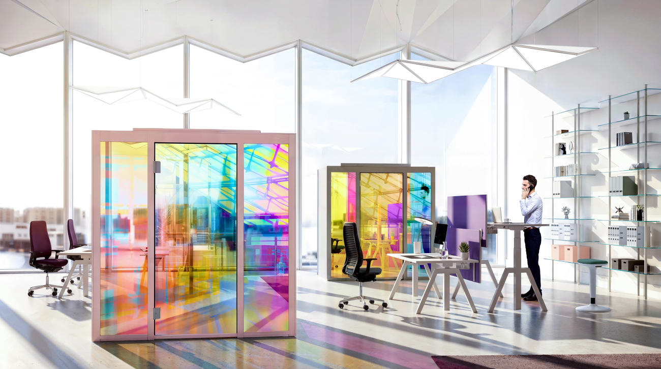
Hybrid working environments require clarity within open structures. Here, Cloud Dancer acts as a unifying spatial element with high light reflectivity. The light, off-white tone:
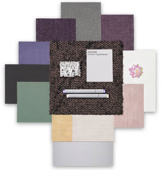
When combined with shades of aqua and blue, soft yellow or pink hues, and muted greys, it creates an inspiring yet orderly atmosphere. Cloud Dancer visually stabilises fluctuating occupancy levels, thereby supporting the flexibility of hybrid working models.
This approach is strategically relevant for: project areas, collaboration zones, desk-sharing environments, and room-within-a-room solutions in open-plan layouts
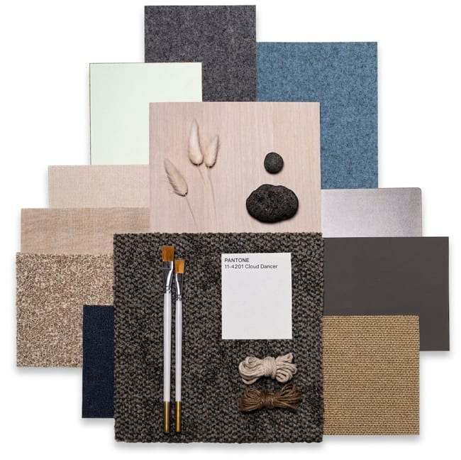
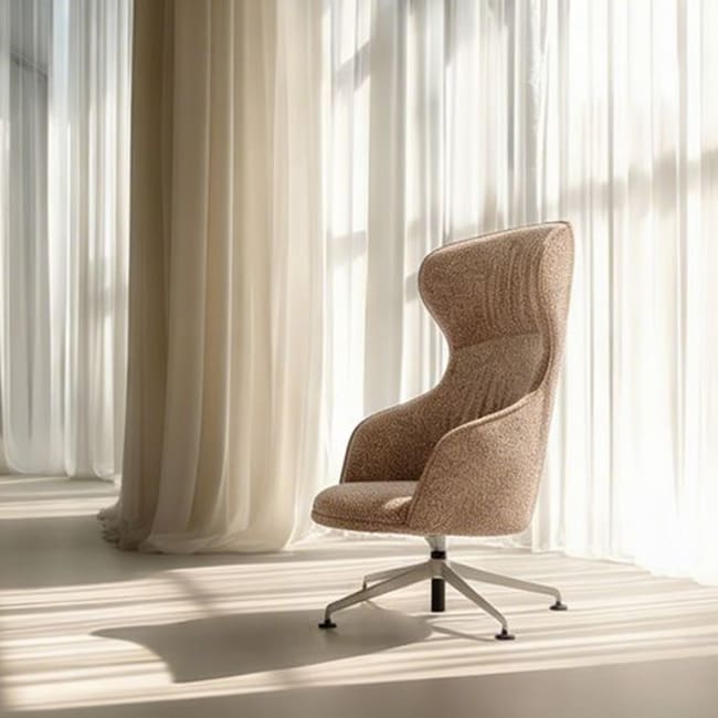
In the second scenario, the focus is on the impact of materiality. Cloud Dancer provides a serene backdrop for:
The minimalist colour scheme creates warmth and depth without visual heaviness. Particularly in:
Focus zones, retreat areas, executive spaces, meeting rooms where people spend a long time
Pure white can appear sterile or technical. Off-white tones such as Cloud Dancer contain a subtle grey or blue component that:
This subtle distinction is particularly crucial in work environments with heavy screen use. The shade appears neutral but not cold – structured but not aloof.
A strategic advantage of Cloud Dancer lies in its brand compatibility. As a neutral base shade, it does not compete with corporate colours but frames them. Brand accents can be used strategically:
This creates a consistent spatial concept that reinforces brand identity without overloading the design.
Colour trends are often seen as short-lived. However, their sustainability is determined not by their media presence, but by their functional applicability.
Cloud Dancer meets several criteria for long-term design:
1. Timelessness: Off-white tones are subject to fewer fashion fluctuations.
2. Flexibility: Accent colours can be swapped out, whilst the base remains the same.
3. Material compatibility: The shade harmonises with natural materials such as wood, felt or wool.
4. Reduced need for modernisation: Calm, fundamental concepts require less frequent updating.
Sustainability thus arises not from the trend itself, but from its strategic integration into a holistic workplace concept.
As a calm, supportive foundation, the colour supports:
In a working world that is becoming increasingly complex, strategic strength lies increasingly in conscious reduction. Cloud Dancer provides the design foundation for this.